One of the first task given to a student, in a scientific laboratory, regarding the presentation of the data to a public, is the fabrication of a poster. A poster contains both visual elements and text, as well as a title with a list of authors and the name of the finance provider(s). It should be understood by the viewer without authors’ explanation, but, often poster sessions – specifically timed in a conference schedule- explicitly ask the main author to remain physically present in front of the poster. It is a perfect occasion to discuss the results and conclusion of the scientific research presented.
So what does fabricating a poster entails? I would describe at least 3 steps that cannot be by-passed:
(1) selection of data
(2) choice of figures
(3) choice of poster design.
Let me clarify each step.
(1) The selection of data is a de-facto step in the creation of any scientific object. The clearer the set of data to present is in the mind of the creator, the best outcome can be achieved. A poster has a physical limited size and it is often considered that too much information can overwhelm and confused – notably on the short-term memory. So a selection of which data set – or even which part of the data set – should be presented need to be made. It is important to also state clearly – on a piece of paper or on a text document – the relationship between the method, the results, the data treatment, and the conclusion. As such, it is recommended to write down the main points to be delivered to the audience, then to organize them by order of importance, eliminates the unnecessary ones (or too broad ones), write down the link between them and give short titles to each of the selected points. This way, a pattern will emerge and will guide the poster creation. For most scientific publications (presentations, posters, talks, articles…) the typical pattern is called IMRAD: shorten for Introduction, Methods, Results and Discussion. Following this organization is safe, it means that the logic of the presentation will be preserved and, since it is familiar, it will be easy to follow. Now, it is, of course, possible to change slightly the order – some prefer to have the methods at the end (as a footnote), some prefer to combine the results and discussion section. Of course, if your own draft cannot fit in this classic pattern, it is possible to completely renounce it. But you will then have to be extremely careful in the naming of your section and how the reader is supposed to read them (in which order).
The introduction section should offer a small view of: what is the subject (are you talking about metals? are you doing archeological studies of knife forgery?) in not more than 3 sentences, why it is studied ( does this material have applications? does the molecule puzzled scientists?) in 2 sentences maximum, what you did and what is new (are you the first to make this experiment with cats? are you the first to develop the code used in the simulation?) in 4 to 5 sentences. You can also use the introduction section to guide the reader, but I would say it is necessary only if the poster reading is confusing/new.
The method section usually contains the first figure (if experimental sciences), it should be summarized so that the reader can follow what you did and why, but not necessarily developed so that the experiment can be reproduced (this level of details are for articles/books/thesis). You should avoid using acronyms as much as possible – apart for chemical formulas. If you are doing experimental science, consider spending time on creating an illustration to demonstrate your experimental method. Not only this illustration will be useful for future presentations (slides, posters, articles…), but it will force you to minimalize the process to the important steps (as it is impossible to illustrate everything). You can write your text in the method section based on this illustration. It will help keep the flow comprehensible (with visual aid) and will be fast for you to write. You can specify in a few more sentences at the end if you did something specific or if you made some changes for the experiment presented in the poster. If you are working in theoretical sciences (mathematics/informatics), the method section will be more difficult to illustrate but not entirely impossible. You could get inspiration from the software LabView, that uses visual clues to create a functioning program. If the section is too short to describe your method, you might want to skip it and adapt your content accordingly.
The result section should be as clear as possible, do not provide graphics without explanations (in the text) and do not cluster your result section. Conserve the minimum amount of results to illustrate your point. At worse, if you really want to show all the results for several similar experiments, consider to write down a table (it should not be more than 4 by 4 or equivalents). Remember that some do not have perfect vision and that color blindness exists. Keep your graphics clear and with large elements (text, symbols, logo…). In the text, all the graphic displayed should be explained: what does the reader should retain from it? If you do not have the place to explain (in at least a small paragraph), then it might mean that you have too many figures. Do not forget that the discussion section can support some type of result-summary if necessary.
The discussion section is not always illustrated but can have a summary-like figure of the conclusion to take home. Each point raised in the introduction and result sections should be answered for – or at least argued on – in this section. This means that if you mention that the previous research did not find what you found, you will need to explain how/why in your discussion. If you present an entirely new way of scientific experimentation, you will need to tell the readers what can be the benefits and shortcomings of it. If you have results discrepancies – an object did not behave like the others but is not an obvious outlier – then, again, you will need to explain why in this section. It is the most important section for demonstrating the merits of your work, be careful in how you present it and illustrate it.
All in all, you should have a grasp of what will be in the poster before even starting it!
(2) As we mentioned previously, a poster is a mix of visual elements and text. But the most prominent part of a poster at long range is, of course, the former. It is therefore important to spend time deciding and “grooming” the illustrations for your poster.
Once the storyline (pattern) is fixed and decided, the illustrations need to be chosen (or made) to aid in explaining it. It is recommended to have no more than 10 figures on a given poster – you will need to explain your figures and you will never have the place to do so if you have a large number of it taking the available space. Do not under any circumstances reduce the size of your figure to accommodate more figures or text – they should be visible from 50 cm away from the poster. I recommend having a minimum dpi of 300 for each figure if possible. You will have to write small captions below the figures (and numbering them), so keep that in mind when you write your text (avoid stating the same thing twice, it will be a waste of space!). It is often recommended to avoid creating graphics representing too many data sets ( avoid more than 6 per figure).
Spend time finicking your figures, they will be the one which will be the most memorable to your interlocutor/reader (with some exceptions). To put an emphasis on a figure, you can add white space (if the background is colored) or a frame around it.
All figures on the poster should have a purpose. If you have a very nice figure but do not know how to integrate it into the storyline, you should discard it. Remember that over occasions will arise for you to make use of it.
(3) The choice of design is surprisingly one that has the most impact on the attractiveness of your poster – not the science! At least, at first glance it is. But, I can guarantee you that an awesome scientific result presented in a messy way will not come across as awesome. Designing is a job – so you cannot be expected to be a designer on top of being a scientist. But – and there is a but – simple rules adapted from design can be easily integrated into your creation routine, and as such your work will be judged on its design.
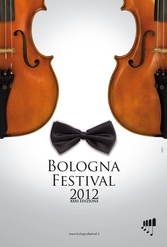
The most important lesson of design is the value and versatility of empty space. I know, I know, it seems wrong somehow to imply that a poster should have empty space and that it will be an important part of it. Well, unfortunately, empty space is one of the best tools at your arsenal to emphasis something or to guide the eye of the reader. If you have ever observed ads (visuals), you might not have noticed, but a lot of it is empty space. It is not laziness from the ad company, it is deliberate and purposeful. Empty space attracts the eye so you might want to have your company logo in an empty space, and it can help shape the entire poster. Look at figure 1, empty space represents more than 50% of the poster – but the reader knows right on a single glance that it is about music, classical music and in Bologna. Everything that the festival wants the passing walker to see at a glance, maybe even make this person stop and look for more information (or remember “concert” and “bologna” and just research about it online later). The logo of the festival, while in the bottom right corner, stand out as well, since it is completely isolated from the other visual and text elements.
Of course, a scientific poster is not an ad. The content should be more than hinted at and rigorous scientific requirements should be met. But I wanted to show how incredibly powerful empty space can be.
Now for the general rules of design:
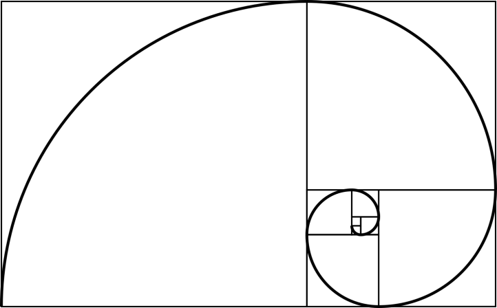
(1) find your focus: the poster should have a point or an area of which the eye is driven too automatically. This is similar, of course, to all the techniques used by painters and photographers alike. The forced perspective, the horizon lines, the direction of regards… You can use empty space to draw a focal point on your poster or a brighter/bigger figure. If you have trouble creating a focus, you can always use the golden ratio: by subsequently dividing a rectangle in a certain way, you end with a final small rectangle that is the focus of your whole original rectangle. Figure 2 display the use of the golden ratio – which the Fibonacci spiral fit well – to create a focal point.
If you do not manage to use the Golden ratio to organize your poster do not panic, there are other ways to help you create and organize space to obtain a focus point. The rule of thirds is, for instance, an easy one to use: you cut your space vertically in three, then horizontally in three, as seen in figure 3. Now, the most important elements can be placed at the intersection of the lines – and you can create a focus by slightly shifting a figure to the side of one of the point and clearing space around it. You can also choose one of the top/bottom or sides to be the most important part of your poster and place your elements accordingly.

You can also use another design, as shown in figure 4:
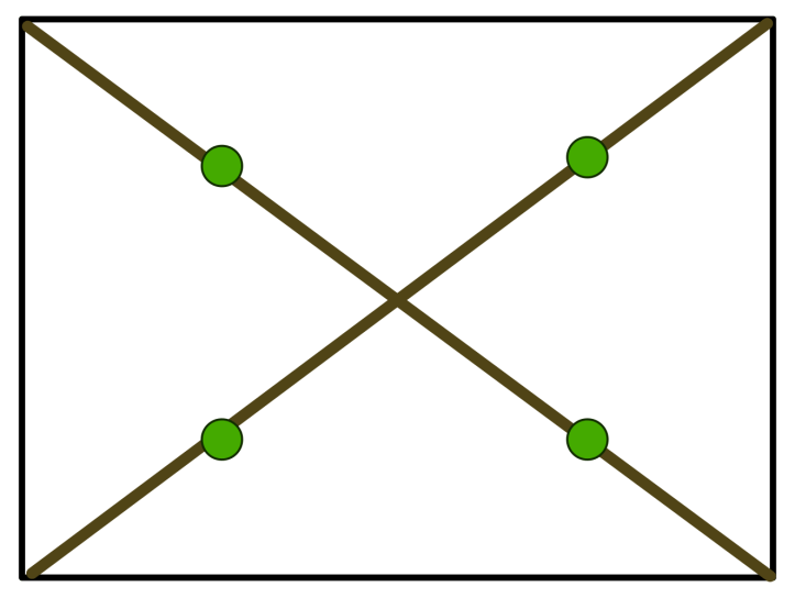
The diagonals are used to draw the eye to the center and each green points can be used to place an important element of the poster.
The lines are only use to place your elements – they should be removed in the final product of course!
(2) use scale (bigger objects = more important ones) and hierarchy (order of elements depending on their importance – for instance, the most important one near the focus).
The ratio between the figure size can be used to help the reader understanding priority – but it can also be used to organize the poster. For instance, the figure in the method section would be half the size of the last figure in the discussion section. I encourage you strongly to use the golden ratio to choose proportions for your text and even figures if need be. It is a ratio that pleases the eye! For instance, it is usually recommended that the title should be readable at a meter from the poster, so usually font sizes around 60-80, depending on the font style. For instance, in one of my poster, I use a text title size of 70 in Times New Roman, and by dividing it with the golden ratio several times, I then use the size 28.4 for my main text.
(3) balance the elements using symmetry or asymmetry. If you make a symmetry goes through your poster, you can place one element out of symmetry to emphasize it. You can play with the “weight” of the figures: a smaller object attracts less attention in contrast to a heavily textured element. If you compare the impact of a photo of an elephant to a simple pencil drawing of an elephant placed side-by-side, the photo will first draw the eye because it is more complex and has more colors. Similarly, if you have a header above your text, the eye will be drawn to the header (that is why its exist!).
(4) use elements that complete each other. The more diverse the source of your visuals, the less they will fit together. The more diverse the font style, the weirder it will be to follow it. It can, however, be used again to create a focus! It needs to be well orchestrated but it is possible (and sometimes used in ads). Be consistent in your choices. If you create graphs, try to use the same software. If not possible, set yourself a self-imposed “style” – the easiest is by defining a color palette and deviating from it as little as possible.
(5) boost or reduce contrast. I would say that for science it is often (not necesserily always) better to reduce contrast. But it can, again, be employed to draw the eye of the reader to a particular area of the poster. For example, by imposing a dark background on a figure (wide framing) or by changing the settings of the text (bold, underline, italics…). Do not overuse contrast – it could lead to confusion and clustering.
(6) Align your elements. Most drawing software provides self-alignment tools so that you can be sure that each start of a paragraph or each figure is aligned to a point of reference (between themselves, depending on the middle of the poster, depending on the focal point, depending on the title of the section, on an imaginary line…). You can also use alignment to create emphasis on a particular element (by shifting it out of line) or to help the reader read the poster in the correct order.
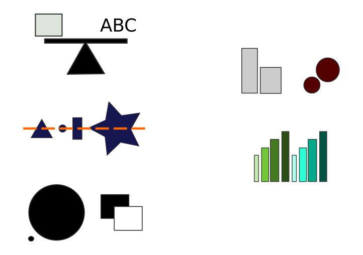
Figure 5 is a visual summary of the design rules to remember for the creation of a poster.
To take home: always know in advance what goes into your poster (create a folder with illustrations) and what story your poster should tell (write down a layout with headers). Only when you know what you want to do, start working on your figures. Remember to have the right resolution for printing (some posters can be as big as A0 format!) and to be consistent in your color/shape assignment. Finally, some basic rules can be applied to help place the different elements on the poster. Not all rules should be used, but they should be known and applied when necessary.
DO NOT CLUSTER YOUR POSTER WITH INFORMATION!
